
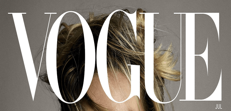
Vogue have used serif type, which is unusual for mastheads as they’re often in a large bold text to ensure they stand-out and are attention grabbing. This demonstrates the high quality and prestige brand Vogue are trying to portray, as well as reinforcing the target audience of females because serif is typically more feminine; serif connotes daintiness and elegance – again reiterating the prestigious status Vogue have made for themselves. The masthead is always dominant of the magazine cover, with the image placed behind the text. Furthermore, ‘vogue’ means fashion and style, setting the tone of the magazine and making the audience aware of the content.
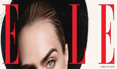
Elle have also used serif font, despite also having a thick, bold type for their masthead (again to be eye-catching) – this reinforces the feminine tone of the magazine due to the ‘girly’ nature of serif. ‘Elle’ doesn’t specifically mean anything apart from being a female name, illustrating the female target audience. The masthead is placed under the image, suggesting it’s confidence that the audience will recognise the magazine.
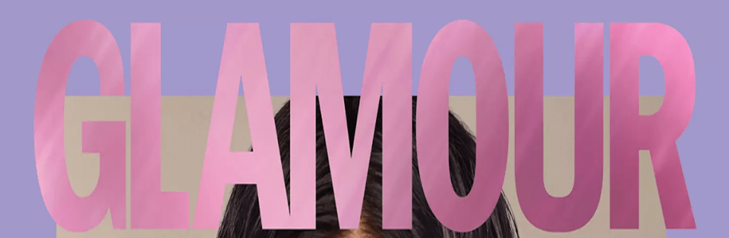
Glamour have typed their masthead in a thick, bold font to stand out to audience members and to catch their eye from the shelf. ‘Glamour’ connotes being chic and stylish, linking to the fact it’s a fashion magazine. The masthead is located on top of the image, implying its dominance and ensuring the audience recognises the magazine. The ‘arrow’ within the M is central on the cover, and is pointing down towards the cover star, this indicates that the masthead is the most significant feature on the magazine, but the image is second to that.
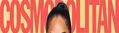
Cosmopolitan have used thick letters with a bold type to ensure they grab the audience’s attention. ‘Cosmopolitan’ doesn’t have any association with fashion but instead means international and worldwide; this presents the magazine as successful and popular globally – appealing to readers due to star appeal. Furthermore, cosmopolitan is also a woman’s lifestyle magazine as well as fashion, therefore the name is neutral to both genres, not categorizing it completely, making their target audience broader. To reiterate their universal status, the masthead is placed behind the model’s head, suggesting their confidence that the audience will recognise their magazine.
